06 April 2021
Class Schedule
- 19 Jan intro and clients | lecture | labs
- 26 Jan servers and command line | lecture | labs
- 02 Feb networks and protocols | lecture | labs
- 09 Feb structural layer | lecture | labs
- 16 Feb presentational layer | lecture | labs
- 23 Feb using a structure | lecture | labs
- 02 Mar behavioral layer | lecture | labs
- 09 Mar design thoughts | lecture | labs
- 30 Mar formulas, functions, vectors | lecture | labs
- 06 Apr data display | lecture | labs
- 13 Apr manipulate data sets | lecture | labs
- 20 Apr relational data bases | lecture | labs

This work
is licensed under a
Creative Commons Attribution-NonCommercial-ShareAlike 3.0 Unported License.
home & schedule | syllabus | contact | grades
The history of data visualization is goes way back.
There are a few names to know and things to think about.
Thinking about the reasons and theory of data visualization
Quoting Edward Tufte in the Introduction of The Visual Display of Quantitative Information
Data graphics visually display measured quantities by means of the combined use of points, lines, a coordinate system, numbers, symbols, words, shading, and color ... Modern data graphics can do much more than simply substitute for small statistical tables. At their best, graphics are instruments for reasoning about quantitative information. Often the most effective way to describe, explore and summarize a set of numbers - even a very large set - is to look at pictures of those numbers. Furthermore, of all methods for analyzing and communicating statistical information, well-designed graphics are usually the simplest and at the same time the most powerful.
With that in mind, let's together consider how one can display data in chart form
Visualization of data has a long history, but the addition of more powerful computing and newer programs has given us the opportunity to display data in ways that are enlightening.
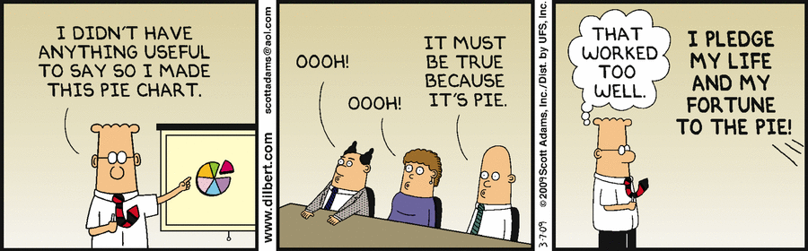
The tool, however can be misused, either by intent or by ignorance
How to Lie with Statistics and The Best and Worst of Statistical Graphics by Michael Friendly at York University, Canada
back to top
Some names to know
Jacques Bertin and his classic book, The Semiology of Graphics
Edward Tufte and his three classics
back to top
Some additional thoughts on data display
Data can be displayed in good and bad ways
Scholars at York University in Canada have put together a useful gallery of good methods of display and also of ideas to avoid
back to top
Does it matter?
Lessons for data analysts from the Challenger disaster tells us good data display could be a life or death issue.
But there are always several different ways to view the same situation and not everyone agrees with Tufte.
back to top
06 April lecture | preps | thoughts about data display | creating a data display