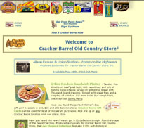
Consider the images being used as navigational elements on the Cracker Barrel Web site. On their own, these images are appealing and certainly fit in to the nostalgic feel of the ubiquitous restaurant chain. But in this case, the graphics don't serve the intended purpose of acting as navigation elements.
Click to view the Cracker Barrel home page.
First, these images don't really hold any inherent meaning to the user. A car, a couple of yokels playing checkers, a jack-in-the-box — none of these possess any inherent relationship to Web site content.
Compounding this problem is the fact that the icons don't really look like they belong together. With their differing shapes, sizes and colors, the images don't work together as a common element.
On the positive side, accompanying rollover text labels do help to lessen the potential for confusion. And the mere placement of these graphics across the top of every page is in keeping with convention.
- Back to Rock City Online Store
- Back to Rock City