The use of tabs in illustrating site organization can be a really effective in that users typically respond well to icons and images that represent familiar items in real life (Niemela and Saarinen, 2000). When implemented properly, tabs serve as a constant reminder of a site's major components.
Click thumbnail image to view the Wall Drug home page.
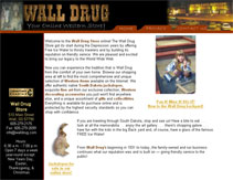
In the case of our roadside attraction sites, however, we see examples of tabs not being used particularly well. Consider the Wall Drug Web site, which uses three tabs across the top of every page. In this case the tabs are confusing because a navigation system has already been put in place as a series of text boxes in the left margin. The tabs and the menu bar conflict, providing a sense of uneven weight among linked pages.
- On to Stuckey's