Because they are typically encountered as the entry point to a Web site, home pages typically serve as indexes to entire sites. The growing availability of multimedia enhancements, however, have sometimes skewed the real purpose of a home page into what is known as a splash page -- a kind of barrier that exists between the user and the sought information.
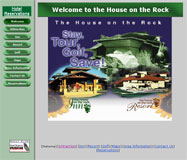
Click on the thumbnail image to view the House on the Rock splash page.
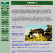
Click the image to view the HOTR attraction page.
Splash pages are strictly about panache and have little place in a discussion about usability. But creative splashes can still seem cool, offering designers the opportunity to show off skills in creating animations or other mini-multimedia productions.
What's puzzling then is when a splash page doesn't at least involve some flashy moving image or jazzy content. Take, for instance, the House on the Rock Web site, which wastes its home page with a large, still image that looks more like a magazine advertisement than an image intended for the Web.
A list of menu buttons in the left margin is the only obvious indication of other pages on the site. Clicking on the "Attraction" link brings up what appears to be the main page. But even this page doesn't really serve as a home page for its extreme length and heavy amounts of text. This attraction page could have been segmented into multiple other pages in order to be more useful and appealing.
- On to Weeki Wachee