Experts and researchers in Web usability tend to agree on what makes a good home-page structure. Elements should include descriptive information about the organization with not too many links presented in a logical manner. A home page should not be loaded with graphics, especially those that fail to serve an informational purpose (Borges, Morales and Rodriguez, 1996).
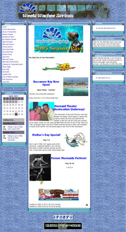
Click to view the Weeki Wachee home page.
Further recommendations call for a top-heavy site, with most images and crucial content immediately visible, and for generally short pages requiring little scrolling at all (Piolat, Roussey and Thunin, 1997).
Breaking many of these rules is the home page for Weeki Wachee, the "city of mermaids." While this page does incorporate a rather traditional three-column layout of text and images, the left-column menu contains too many links to be useful. The design could have collapsed many of these link labels into categorical links in order to be more inviting.
Besides the lack of any aesthetics, the site is littered with photos and cartoon images that lack any importance. And the page length is unnecessarily long with large amounts of unused space.
Unfortunately, most of these usability and design violations carry over to the rest of the site, thus earning the home page another demerit for not being distinct from other pages that comprise the site.
- Back to House on the Rock