
Information Design - Examples and Discussion
Change to the plan
Victoria's blog posting caused me to think and then to decide we need your input on the discussion of design.
Accordingly, you all have three things to do to prepare for class this coming Tuesday
- bring with you one example of what you consider to be a very good information design
- bring with you one example of what you consider to be a terrible information design
- be prepared to show your examples and to discuss them with your peers
They don't have to be web sites; they can be any examples of good and bad design, and all designs convey information in some manner.
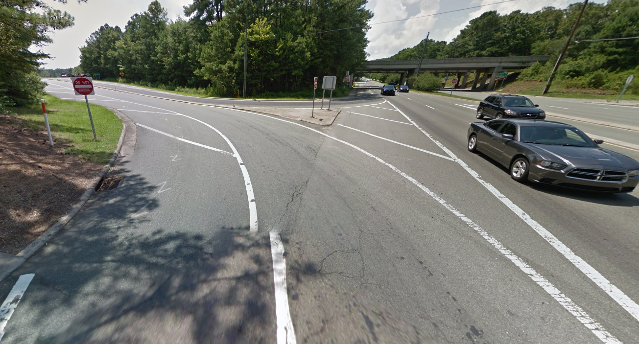
Here's an example. The curving entry from 15/501 South onto 54 East has a stop sign, even though it has a run on lane. Since there is no traffic coming from the west that traffic coming from 15/501 will need to yield to, there is no need to stop; a yield sign would suffice.
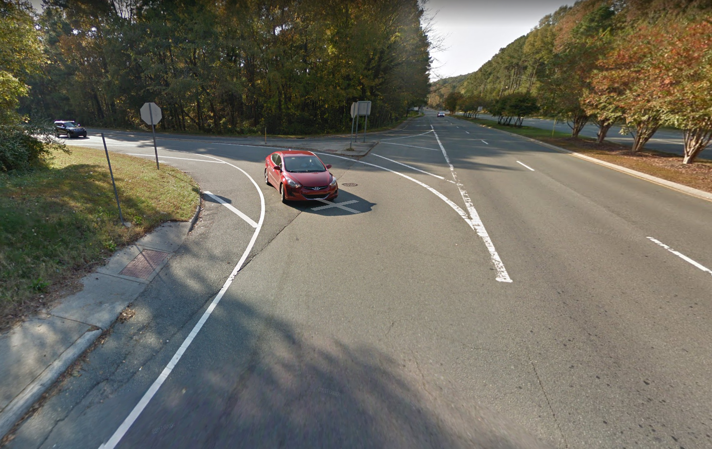
This just reinforces bad behavior as drivers know they don't have to stop here, and may carry that behavior over to places where they should stop.
If one just goes to where 15/501 North merges into 54 East, one sees a yield sign. This makes more sense.
Our goal today ...
... will not be to cheer good design and not to mock back design (though some mockery may well occur). Our goal will be to understand why some designs work and why some fail.
Think about some of the principles we have discussed over the past week and be prepared to use them in your discussion.
[top]
You don't have to read these unless you wish to, but we might touch upon them in conversation
Interaction Design Foundation, Guidelines for Good Visual Information Representations
Amy Balliett in Smashing Magazine, 14 October 2011, The Do’s And Don’ts Of Infographic Design
Ponder the points made in the articles to how you display information in your own life and work.
[top]