Tools for Information Literacy
thinking about our style choices
Thinking about style choices - why do we need to do this?
If we don't care about how our document will look, we can rely on MSWord to make decisions for us.
And the output of our document will be adequate. But is "adequate" and "good enough" all we want to be recognized for?
Last week, we learned how to generate a document. This week, we want to think about why we want it to look a certain way and why that leads to using certain tools. So, let's start with a few principles.
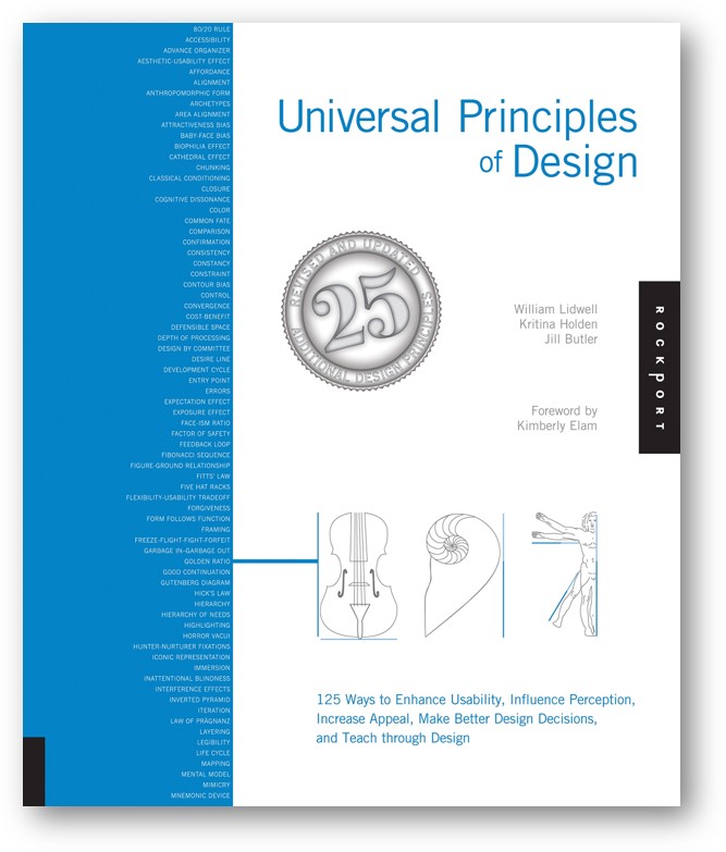
In the book, Universal Principles of Design by William Lidwell, Kritina Holden, and Jill Butler, the forward notes that success in design is founded on an understanding of the people who will use that design. Using a tool like MSWord is an exercise in the design of text and objects to communicate to a reader. So, understanding what readers need, and understanding how they perceive what they see, can guide our decisions on style choices.
Some of the most important principles to keep in mind include:
- Hierarchy of needs - it needs to be functional and usable, before it becomes creative. Make sure your work is readable.
- 80/20 rule - 80% of the effects of a document are caused by 20% of the objects in it. Focus on the critical 20% of the document's features that are used 80% of the time.
- Satisficing - is is often preferable to settle for a satisfactory solution, rather than to pursue an optimal solution.
- Hierarchy - hierarchical organization is the simplest structure for visualizing and understanding complexity.
- Gutenberg Diagram - Western readers typically begin to perceive a document at the upper left quadrant and read across and down the display to the right lower quadrant. Also called "reading gravity", this left-right, top-bottom behavior can be undrstood when we decide to position elements on a page.
There are 120 other principles in the book, should you choose to explore further on your own.
We can use this new understanding to move on to thinking more about the visual elements in the document.
principles letter text grid uses of concepts other resources
back to top
What are the elements to think about? One is letter.
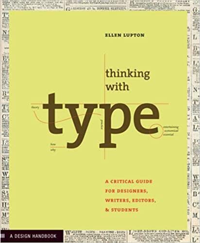
Ellen Lupton's Thinking with Type leads us on a journey of understanding how letters become text that fits in to spaces in a grid on a plane. While in MSWord, the text is only one of the planes in the document, it is the one we will start with.
Thoughts on letters
Is it a typeface or a font? A typeface is the design of the letterforms; a font is the delivery mechanism. Typeface is the visual design, while the font is the software that allows you to use design. The terms may be used interchangeably, though there is a difference.
There is a lot to learn about typefaces/fonts, but perhaps a visual discussion would be a satisficing action for this goal.
If we want a closer to optimal discussion, we can follow Ellen Lupton's discussion of some that are relevant to our needs at this time.
principles letter text grid uses of concepts other resources
back to top
Letters become words, and words in sequence, are the text of a document.
Text in this discussion is about the blocks of text, the paragraphs, and not the headings, headers, footnotes, or footers that are also composed of letters.
Lupton's thoughts on text and how it relates to what we need to do
But Lupton does discuss headings in Heirarchy.
principles letter text grid uses of concepts other resources
back to top
But how do they look on the page?
Design is as much an act of spacing as an act of marking.
The above quote came in a discussion of spacing in letters, but it equally applies to the act of spacing on a page.
Typically in using MSWord, we will be content to place the body of the text in a pre-defined space on the page. We can define that space, however, by using page, style, and paragraph tools (and their associated dialog boxes) to create our own definitions. We might, however, benefit from thinking a bit more deeply about what a grid entails
Lupton's thoughts on grid, beginning with a discussion of the most elegant spacing we might not even notice that we see.
We may never need to do this, but knowing about grid can enhance our appreciation of the tools we do use.
principles letter text grid uses of concepts other resources
back to top
Combining principles, concepts, and tools together
Why use headings?
We can recall back to the principles and recognize that headings
- are navigation signposts
- help guide readers through documents
- announce forthcoming information
Documents should have an adequate number of headings to serve these purposes. Typeface, size, style, and alignment can be used to visually display different levels of importance.
How much do we need to think about typefaces?
Your choice of typeface can improve or reduce the persuasive impact of your text. There are any number of "experts" who will state "rules" for typeface choices, but they are just opinions. You can decide on which typefaces enhance your design. Make your own decisions, based on your own sense of professional need, your own esthetic choices, and your own sense of how well your choice aids the user's ability to understand and use your work.
Learn the basics and trust yourselves.
There are several things to condsider.
- use as many typefaces as you need in your document, but keep the number of different typefaces as small a number as needed
- be certain that your choice is readable against the background you choose to use
- align your paragraph text to the left only; right aligned (or, justified) paragraph text results in changes to word spacing, and can be a bit harder to read
How should we fit things into our pages?
Don't cram too much into your available space. Ensure that top, bottom, left, and right space margins frame the elements on a page. Take into consideration how big your page is in final form (8.5x11, 5.5x9.5, letter or landscape?). Trust your eyes.
Allow for space around visuals. Don't use frames, which confine the image; rather allow the white space around the image to blend into the white space of the page.
principles letter text grid uses of concepts other resources
back to top
More reading, if you want it
The Elements of Typographic Style, a book on typography and style, has been highly praised as "the finest book ever written about typography".
Originally published in the 1920s, The New Typography was a reaction against the perceived decadence of typography and design of the late 19th century. Modern typography reflected a modern, universal method of communication. The hallmark of early modern typography is the sans-serif typeface.
principles letter text grid other resources