27 Nov 2018
Class Schedule
21 Aug | intro
23 Aug | clients
28 Aug | servers
30 Aug | networks
04 Sep | basics lab
06 Sep | structural layer
11 Sep | presentational layer
18 Sep | working with layers
20 Sep | behavior layer
25 Sep | images & design
27 Sep | website lab
02 Oct | object layers
02 Oct | graphics
09 Oct | document markup lab
11 Oct | spreadsheets, formulas & functions
16 Oct | thoughts about data display
18 Oct | Fall Break
23 Oct | database tools
25 Oct | spreadsheets lab
30 Oct | relational databases
01 Nov | tables
06 Nov | relationships
08 Nov | input & output
13 Nov | SQL
15 Nov | complex queries
20 Nov | databases lab
22 Nov | Thanksgiving
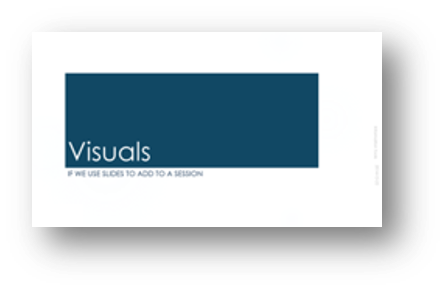
27 Nov | presentations in general |
designing |
next session
29 Nov | presentation delivery
04 Dec | presentation lab
13 Dec | 0800-1100 | final in class presentation

This work
is licensed under a
Creative Commons Attribution-NonCommercial-ShareAlike 3.0 Unported License.
home & schedule | class blog | syllabus | contact | grades
Manage your visual presence by realizing what the presentation tools can and cannot do for you.
Effective design comes from understanding of PowerPoint's tools
But let's start with some advice
five not to do
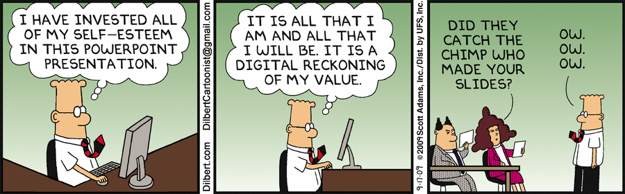
- Don't overload your slides with mountains of text. The only thing duller than listening to someone read a speech is to follow along on screen while they are reading it.
- Don't put long lists of bullets on a single screen. Present no more than three points on a single slide, and keep them short.
- Don't use cute or curly typefaces. PowerPoint presentations are carefully planned and scripted. Save spontaneity for your oral delivery. Keep your electronic presentation calm and authoritative.
- Don't use complex, distracting backgrounds. If your presentation is dull, a rainbow-colored gradient won't make it more interesting. For showing your presentation on a screen, a black background with white text is considered ideal - the background disappears, allowing the text to float.
- Don't produce an important document in PowerPoint when another format would be more effective.
and five to do
- Do anchor your thoughts with short chunks of text, underscoring your subject matter for the audience. Use text to inspire and provoke people, not to impress them or lull them to sleep.
- Do ask questions. Posing a concise and provocative query on screen can build interest and suspense.
- Do choose a clear, readable font and deploy it in consistent sizes, large enough to read from a distance.
- Do use images to illuminate and demonstrate your ideas. Add some "show" to your "tell".
- Do consider alternative tools.
back to top
Setting up your look
We'll look at modifying design objects with in-class demos.
Interspersed with advice
Myth: There's no need to use graphical cues to point out the organization of the presentation.
Truth: Research shows that people learn better
when visual cues are used to highlight a presentation's organization.
back to top
Design Templates
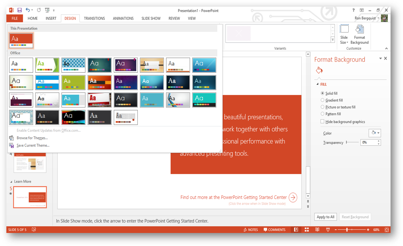
Themes provide you a pre-set background and pre-selected font and bullet formatting.
There are lots of resources for themes - Slide Carnival is one such resource.
back to top
back to top
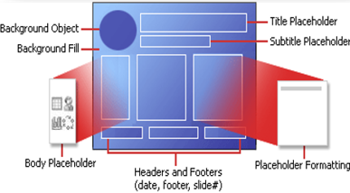
Layouts
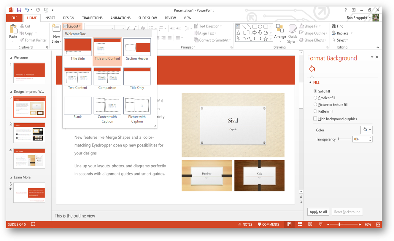
Slide layout gives you a vessel already formatted for you to put your content into;
gives you a preview of the formatting; and
you can reapply different layouts to slides already constructed.
back to top
Interspersed with advice from Slideshare
As a general rule, never use Clipart. It often looks dated.
back to top
Using Existing Presentations and Slides
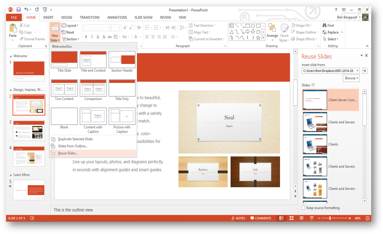
This tool allows you to insert one or more slides from an existing presentation into the new one you are creating. Inserted slides do not bring their template formatting with them, but rather inherit the template formatting of the presentation into which they are inserted (unless you decide to keep their design template).
back to top
Masters and Modifying Masters
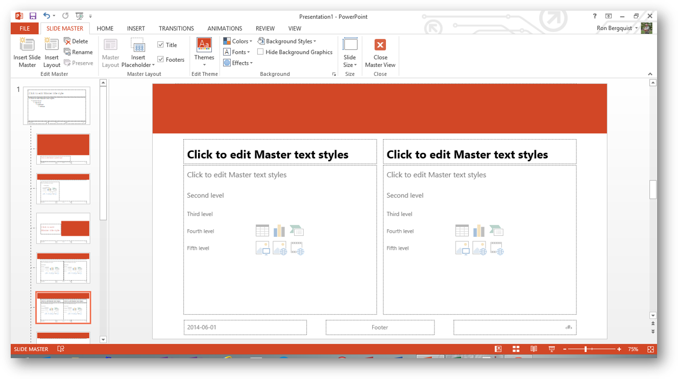
These tools allow you to customize formatting of the various master slides that are part of the theme you are using.
back to top
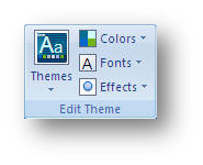
Customizing Themes
You may change the themes, colors, fonts, and effects.
You may create a new background or modify the one you have.
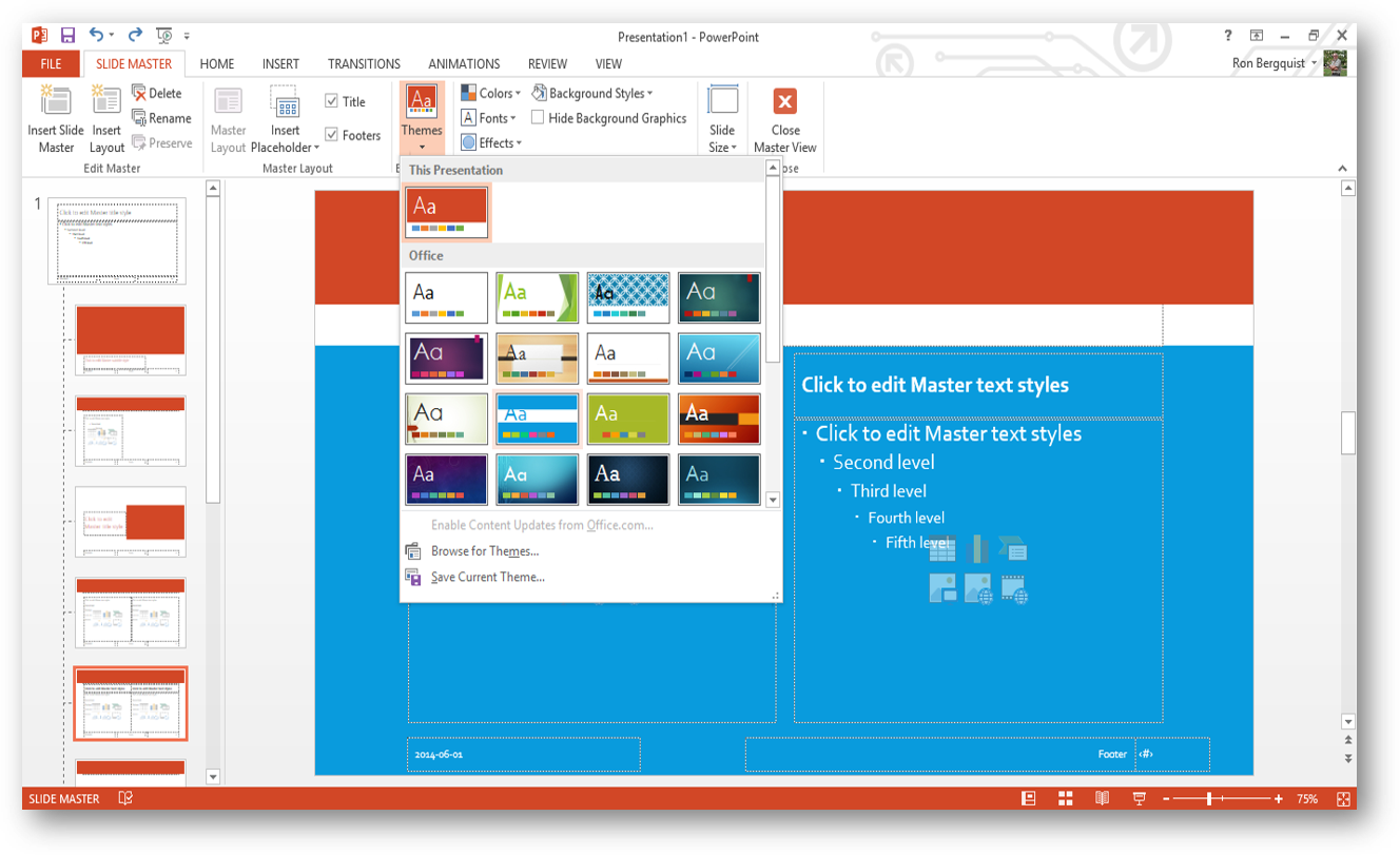
You can format the colors in multiple ways, format the texture and pattern, or create an image as a background to all your slides. You can apply the new formatting to one or to all of your slides.