Templates
| notes | recording |
|---|---|
| 603 is better; all students should use 603 recording | Class Recordings on Panopto |
Now that you have finished task 02.01 and 02.02 it is time to pick a template that you like and start building out your site.
Review
Task 02.02 Link CSS
If you have not completed this task or made corrections, it will not prevent you from moving on in today's session; so, don't be anxious about not being able to move ahead. However, please make it a priority to wrap up this task as soon as possible. Let me know if you need help getting this done or making corrections.
Navigation
Navigation design is one of the most important, and challenging, tasks within web development. If you want navigation to adapt to different layouts based on screen size, that makes it even more challenging. When a site design can adapt to various screen sizes, that site design is known as being responsive.
While it is possible to create multiple sites for different devices and screens, that approach becomes overwhelming to manage and keep in sync. Therefore, as a one-man-shop-web-solutions-provider for small and medium sized organizations, I only develop one, and only one, site that will work anywhere: phone, tablet, laptop, or wide screen monitor. For that to work, I have to use media queries.
It is difficult for beginners to create optimum responsive design using media queries, so all of my template examples that I will demonstrate today will be more, or less, responsive templates. Learn more here: Smashing Magazine: Responsive Web Design.
Responsive design was first discussed by Ethan Marcotte in 2010. If you choose a theme that is not responsive you are 12 years behind the times. However, there is no penalty, grade-wise, for creating a non-responsive 02.03 project. But, if you want you use your site as part of your skills portfolio, go for a responsive template framework like Bootstap 5. (The single page examples below are based on Bootstrap 5.)
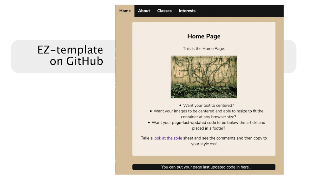
EZ Template
- Take a look at the finished sample site on my opal account.
- Make sure to right click on every page and see how the navigation is different for each ACTIVE page. This is critical to grasp. This relies on an a css class of
.active. - Or if you want to understand the concepts more fully, download the template at EZ-template Repository on GitHub and follow the instructions on the github main page.
The template on GitHub only has a working home page which is the index.html file.
The goal of this exercise, and practice, is to show you how to create multiple pages from this template or any other template. You will see how the CSS file controls all of the colors and fonts to customize the template to suit your needs.
As you change the look and feel, be sure to have a goal to make your site colors and typography easy to read and meet accessibility guidelines. (we will cover that in a later recitation).
Multi-Page or Single Page?
If you choose Multi
If you decide to use a multi-page template like the EZ Template, or any other multi-page template, you will need to create multiple pages, which can be confusing because you must clone a page and then update that page so that is not a clone. At first, it can be very disorienting to debug cloned pages as they are absolutely identical after being cloned. Once you get one or two pages working, it is easy to continue the process.
Impact on Primary Navigation
- All of your links point to other pages.
- If you are using
activeclasses, then you have to reset these for every cloned page.
If you choose Single
For most small personal sites, it is more efficient to use a one-page solution. However, "all of your eggs are in one basket"—one small error might bring down the whole page. To prevent this, first get all your links working and save a backup.
You may need to do some cloning for a single page site. For example, if your one-page site has only three sections, you must clone a section. If it has more sections than you need, you will need to delete a section. You must add or delete in both the content and the navigation, or it will not be consistent. Cloning is still easier in a single-page site than a multi-page site.
Impact on Primary Navigation
- All of your links points to IDs in your one-page site.
- If there are
activeclasses, they are usually automatic in the included template javascript or css.
Single Page Template Demo: Scrolling Nav
Today I will demonstrate a free, fairly simple, single page template that is based on the Bootstrap 5 Framework. The Bootstrap Framework is currently in version 5, so it is very up-to-date. Getting the template from the source required a few extra steps that increased the likelihood of confusion and time loss, so I have made a copy and posted it here to maximize our instruction time:
After you download and unzip it, there might be a folder in a folder. I so, pull the inside folder out onto your desktop and delete the main folder. Confirm you really moved out the inside folder and then delete the empty main folder.
You can view the online demo here:
During the recitation, I will demonstrate how you can...
- Find a free image at Unsplash
- Quickly modify images without having to use Photo Editing software. You need to make sure your images are downsized so that they don't take more time than necessary to download.
- Change the blue background to be an image. Warning: When you put images into the header and have text float on top, you might very well run into legibility problems.
- Use the Inspect tools to temporarily edit html and css to see live changes. (These are non-destructive changes. Refresh the browser and they reset back to the original.)
- Overcome any text over image legibility issues with a few lines of CSS code.(see code below.)
- Go over the sub-tasks you need to do to meet all the requirements of the 02.03 Task. (See the Checklist in the left sidebar).
This is the code we will use to customize the header:
.custom-header {
    background-image:url("../img/background-image.png");
    background-position: center center;
    background-size: cover;
}

.custom-dark-glow {
    color:cornsilk;
    text-shadow:1px 1px 10px #000, 1px 1px 10px rgb(29, 29, 29);
}
Here are two examples of how I have made changes to the Scrolling Nav theme to change the header:
Scrolling Nav: Grungy Header
Scrolling Nav: Low Contrast Header
- Low Contrast Header I have added in some bootstrap 5 components that you might like to include in your site. These components are transferrable to other Bootstrap 5 templates.
Other Templates
Here is a link to more free Bootstrap 5 templates
More template sites from Fall 2022 Semester Site
Scrolling Nav Documentation and Sample Site
If you decide to use the Scrolling Nav template here is the documentation and example site:
Working with Found Templates
Disclaimer: This theme site where this theme was originally, https://templated.co, is no longer as it was. It may be an unsafe site. Do not go there.
Sometimes domains expire and the domain is purchased by hackers. This may may be the case, but I am not sure because I prefer to stay off the site. The safe template link below is a copy from when the site was safe. It is an older theme, but I put in a lot of time documenting it. The tutorial is short and still valuable, so I have posted it here for reference.
Safe Introspect copy on OPAL.
If you decided to download a template from the web, here is a video that will show you how you might set it up for your 02.03 project. If you don't want to create the additional pages for the third level task, you can copy the JavaScipt tabs from EZ template here.
If you cannot see the embedded video, you need to log into UNC Panoto
I will find some more templates out on the web and link them here before this class. If you find any on your own, just send me a link via email and let me take a look at it before you invest a lot of time. It might have some issues.
Inspector Tool
I highly recommend that you to watch this video from Khan Academy to experience the power of the Inspector tool: Using inspect element for CSS styles