Home Schedule Canvas Syllabus Contact Options Last Updated on

Tools for Information Literacy ⑬ Data visualization

Using Excel to create visualizations

Does it matter?

Lessons for data analysts from the Challenger disaster tells us good data display could be a life or death issue.

But there are always several different ways to view the same situation and not everyone agrees with Tufte.

Dilbert cartoon from 07 March 2009

Types of charts

Spreadsheet data can be converted into many different ways of displaying data in charts.
But one needs to know what type of display is best suited for the underlying data.

Charts are a useful way to illustrate data shown in worksheets. Excel has several different types of charts to select from depending on the sort of information you are using and the effect you wish to convey in the graphic.

to show comparisons

Column charts compare values across categories.

[column chart types]

The same is true in Excel for Mac

[column chart types]

bar charts are essentially the same thing, but oriented on the horizontal axis. Excel asserts they are the best chart type for comparing multiple values.

The same is true in Excel for Mac

[bar chart types]

Another way to consider charting parts to a whole

Line charts compare continuous data over time against a common scale and are ideal for showing trends.

[line chart types]

The same is true in Excel for Mac

[line and pie chart types]

Area charts are a variant of line charts

Area charts emphasize differences between several sets of data over a period of time.

[area chart types]

Scatter charts

Scatter charts compare pairs of values, depicting them as sets of X and Y coordinates.

[scatter chart types]

percentages

Pie charts displaypercentages

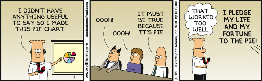
But column charts do the same and in a more revealing fashion. Use a pie chart to show the relationship or proportion or parts to a whole, only when you want your chart to be metaphoric.

[pie chart types]

To quote Edward Tufte in The Visual Display of Quantitative Information, p. 178

... the only worse design than a pie chart is several of them ...
Given their low data-density and failure to order numbers along a visual dimension,
pie charts should never be used.

Pie charts, however, are useful when the point is proportionality

Pie Charts are best at visually illustrating the proportion of a part in relation to the whole.

Creating Charts

Start a chart by selecting the data you want to chart. When doing so, keep the following points in mind:

  • Excel will use the column and row headings as the axis titles and legend (you can select which is which)
  • if your chart includes a total row, you most likely will not include this in the charted data. Just include the individual data series
  • in some charts, you can chart only one series. That means you can select only one set of data to chart.

Charting Tips

One can create the chart on a new worksheet or within the current worksheet, depending on the data is to be displayed.

Change colored data series to patterns and shades of gray if you plan to use the chart in a print document.

Using the Chart tool

Select the data array to be charted

  • go to the worksheet where the data is located and select the appropriate data array
    • NOTE: you usually do not want to select "Totaled" cells, columns, or rows

Select the Insert ribbon to see your chart options.

The tool will place the selected chart type on the same worksheet. You may wish to change this by moving the chart location to its own sheet.

To work on making the chart look and display as you wish it to, right click to reveal the chart editing options.

You have many formatting options, depending on the part of the chart that you select. Chart areas include:

  • Chart area
  • Plot area
  • Data series
  • Chart title
  • Legend
  • Axis
  • Category axis title
  • Value axis title
  • and more depending on what options were selected in creating the chart.

You can also do more specific editing by right clicking and selecting the data to edit.

Chart Formatting Things to know...

... when fine-tuning your chart

When you put your cursor over an area of the chart, a tooltip appears. The tooltips provides chart information. Each of these areas can be edited/formatted. If you put the cursor over data point in chart, the tooltip will tell you the value of the data point.

You can chart data on two axes to compare two values.

If you want to plot two values on the same grid, you can choose to have two differing axes if you use two differing data types.

You will need to change the series to a different chart type.

And then work to format two axes to depict two data sets on the same chart ...

... which will allow you to have two separate scales on a single grid.

You can make your own charts using the tools available.

back to top
back to top