SEMESTER PROJECT
This is a project-based course, which means that a substantial portion of your grade will be derived from a large semester project. The projects are a team effort, with groups of 3-4 people collaborating on a single large project that is due at the end of the semester. Your project teams with have the opportunity to choose your own project topics, gather and clean your own data, create your own design, and develop your own prototypes.
To help you appreciate the scope of the projects, below is a gallery of select example projects from past offerings of this course.
PROJECT GALLERY
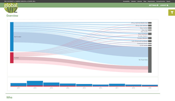
UNC Center for Global Initiatives
In collaboration with the UNC Center for Global Initiatives, we designed and built an interactive visual analytics platform to allow our client to explore primarily categorical data about those who have applied for funding to complete a global opportunity. We aimed to provide a tool to help the Center to operationalize the robust data they have collected for years to improve programs and better reach target demographics.
The primary sankey or flow visualization (shown in screenshot) allows a top level view to compare the locations of those who are funding or not funded, as well as those are are identified as "underrepresented" or "underserved" based on demographic data. Users are able to drill down into the data to begin to examine intersectionalities that exist between and within groups. Further, numerous filters allow the examination of particular groups of interest, for example, first-generation college students.
Due to the sensitive nature of the data this application is not publicly viewable, but feel free to contact the project team with questions at inls641-fall2017-t1@office.unc.edu.
NOTE: The data used in this project and shown in this example screenshot was submitted voluntarily by students who applied for funding with the Center for Global Initiatives, and was not supplied by the official student data stewards at the University of North Carolina at Chapel Hill. Thus, metrics shown may not match official University statistics. (This disclaimer is required per UNC ITS Security and the Registrar's office.)

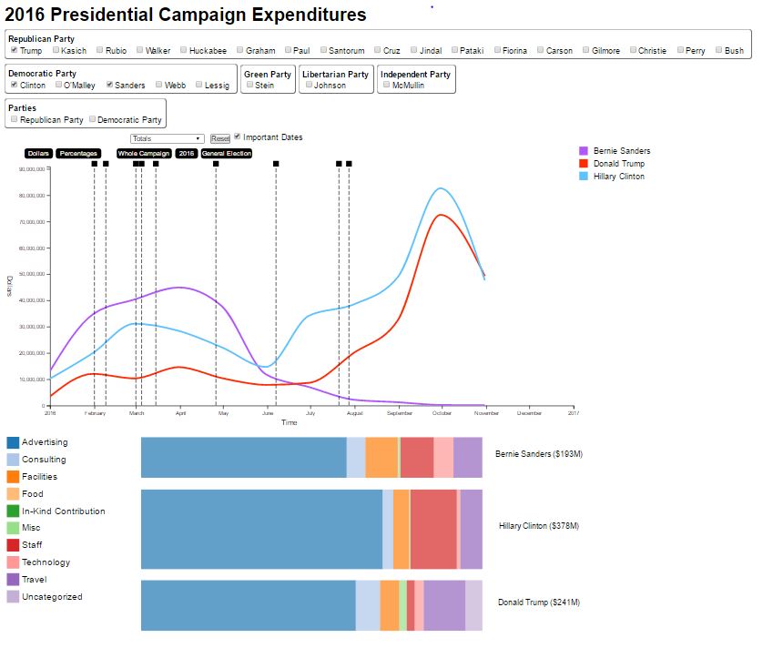
The 2016 Presidential Campaigns
This visualization is designed to allow users to explore the 2016 United States presidential election through the candidates' campaign expenditures. Users can investigate how candidates allocate their funds and how candidate's spending changes over the course of the election. The data for the project was acquired through the Federal Election Commission, which publishes data on all federal-level elections.
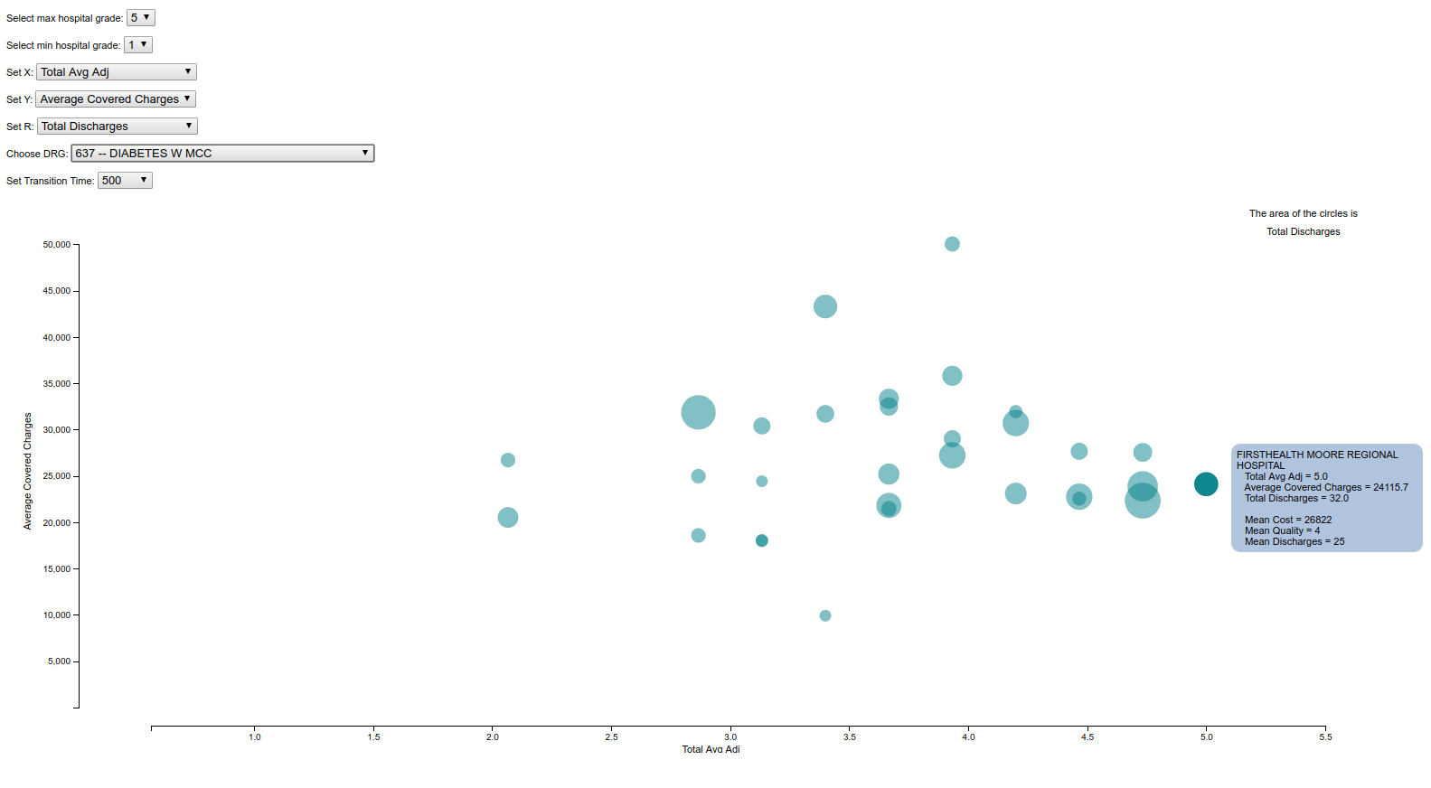
Hospital Cost and Quality Evaluation
This visualization allows users to interactively explore the relative cost, quality and volume at North Carolina hospitals for several diagnostic codes and classes of procedures. The data is derived from information published by the Centers for Medicare and Medicaid Services and lets clinicians, administrators and patients see how different facilities compare.