
Thinking about the reasons and theory of data visualization
Visualization of data has a relatively short history (The Golden Age of Visualisation by Juan C. Dürsteler, Inf@Vis), but the addition of more powerful computing and newer programs has given us the opportunity to display data in ways that are enlightening (Visualisation in the 20th century by Juan C. Dürsteler, Inf@Vis).
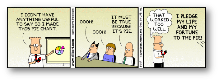
The tool, however can be misused, either by intent or by ignorance
How to Lie with Statistics and The Best and Worst of Statistical Graphics by Michael Friendly at York University, Canada
[top]
Some names to know
Jacques Bertin and his classic book, The Semiology of Graphics
Edward Tufte and his three classics
- The Visual Display of Quantitative Information and as Tufte sees it
- Envisioning Information and as Tufte sees it
- Visual Explanations and as Tufte sees it
[top]
Some additional thoughts on data display
Data can be displayed in good and bad ways
Scholars at York University in Canada have put together a useful gallery of good methods of display and also of ideas to avoid
You have a lot of good examples to study for inspiration and emulation.
[top]
Does it matter?
Lessons for data analysts from the Challenger disaster tells us good data display could be a life or death issue.
But there are always several different ways to view the same situation and not everyone agrees with Tufte.
Let's re-iterate our points again.
[top]